More Than Shelter: The Meaning Behind Our New Logo
At Monadnock Area Transitional Shelter (MATS), we’ve always been more than a roof over someone’s head. We are a place of safety, healing, and possibility. A place where dignity is restored and futures are rebuilt. What makes MATS unique is that we are transitional. Beyond providing shelter, we work closely with each participant through our Program Manager, helping them take intentional steps toward long-term stability. This means offering support like job training, connecting them with critical state and local agencies, and building self-confidence so they can successfully navigate life ahead. Our role is not only to provide immediate relief but to equip individuals and families with the tools, resources, and hope to transform their futures.
Why We Rebranded
As our work continues to evolve, so too must the way we tell our story. That’s why we’re proud to share our refreshed brand identity, centered on our new logo: The Path of Transformation.
Our mission is clear: to empower individuals experiencing homelessness by providing transitional housing, compassionate support, and vital referrals, while also raising awareness and advocating for lasting solutions. This mission calls for a brand that reflects not just what we do, but why we do it. The rebrand allows us to communicate our ethos with clarity and heart. It gives us a voice that is both modern and timeless. One that represents the resilience of our community and the transformative journeys we are honored to witness every day.
A cornerstone of our rebrand is the launch of our new website. More than just a fresh design, the site was built to be a lifeline and a resource — a place where individuals in crisis can quickly find the help they need, where potential participants can access clear information, and where donors can see the tangible impact of their support. Most importantly, our website now reflects the true spirit of MATS: not only the services we provide, but the stories of transformation, resilience, and hope from those who have walked this path with us.
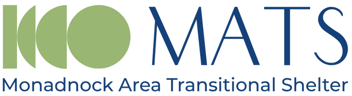
The Path of Transformation
At the heart of our new look is the Path of Transformation logo. Its design captures the powerful journey of change that begins at MATS: From instability to strength. The arc in our logo, beginning as a single line and evolving into a full circle, represents the forward momentum of transformation. It’s a reminder that true growth doesn’t happen overnight, but through steady progress, intentional support, and the courage to keep moving forward.
From uncertainty to hope. The path conveys motion, healing, and the courage it takes to keep moving forward. It symbolizes that lives can come full circle and find a place to land with dignity. From shelter to empowerment. This logo is more than an image; it is a promise. It shows that MATS is not just a place of refuge, but a catalyst for rebuilding and reclaiming the future. One intentional step at a time.
Colors and Spirit
While our logo and design have evolved, our colors remain rooted in the familiar. By staying within a recognizable palette of blues and greens, we’ve created continuity between where we came from and where we are today. This was an intentional choice: to honor the trust, recognition, and sense of stability that our community already associates with MATS.
Blue has long symbolized safety, trust, and reliability — values at the core of our mission. Retaining this hue reinforces our commitment to being a steady presence for individuals and families navigating uncertainty.
Green reflects growth, renewal, and hope. Its continued presence bridges past and present, reminding us that transformation is not about leaving behind who we were, but about building upon it to create something stronger and more enduring.
Together, these colors connect our history with our future. They offer a sense of cohesion and recognition for those who know us, while also communicating an inviting, refreshed energy for those meeting MATS for the first time. This harmony between continuity and renewal mirrors the very work we do: helping people honor where they’ve been, while supporting them in building the life ahead.
What This Means for Our Community
This rebrand isn’t just about a new logo or fresh colors; it’s about alignment. It ensures that every time someone encounters MATS, they see not just an organization, but a movement of compassion, resilience, and transformation.
Our brand now mirrors the stories of the people we serve. Stories of courage, healing, and new beginnings. It also reflects the dedication of our supporters and partners, who walk this path with us and help make transformation possible.
Moving Forward Together
As we embrace this new chapter, we invite you to see yourself in this journey. Whether you are a donor, volunteer, advocate, or neighbor, you are part of this story of transformation. Together, we are shaping a future where every individual and family has the stability, dignity, and opportunity to thrive.